For the first time ever, I am participating in another photography project, hosted by Stacy Fischer at Visual Venturing. What makes “One Photo Focus” interesting is that it challenges photographers from around the globe to focus their image processing talents on a single image. Yes, we are all working on the same picture! This happens on the first Friday of the month in Washington DC, which equates to the first Saturday of the month in Australia!
First, I want to thank Shane Francescut for providing one of his images for whatever purpose participants may choose! Secondly I am grateful for Stacy’s encouragement over a few months to get me to have a go, and for her detailed instructions on how to take part. I have been watching from the sidelines for a while now, and finally summed up the courage to take the plunge. And thirdly I want to thank Leanne Cole who just happened to coach me on Photoshop’s masks and layers the week before! It has come in handy and is slowly sinking in, Leanne!
Onto the May Photo
I have to say that for my first attempt this wasn’t the easiest image to work on! Here is the original :

Image by Shane Francescut
When I looked at it I thought: “beautiful dome and glasshouse, but shame about the buildings at the back.” So before even worrying about how to do it, I decided I would:
- Crop the image
- Remove the ugly buildings behind the glasshouse and the playground feature at the front
- Bring in a more interesting sky
- Reformat the image – either as a panoramic to emphasise the long glasshouse structure, or as a square with the glasshouse at the bottom of the frame if I could find a ‘big’ sky as the focal point.
Being new to Lightroom and Photoshop, the learning curve is steep but I wanted to practise what I had learnt in my latest class on masks & layers. So over many hours, I worked on making my ideas for Shane’s image come to life and became a little more comfortable with a few tools. It took me multiple attempts to get it right, but I had fun.
Summary of my editing process
I took Shane’s raw image into Photoshop and did the following:
- Tweaked the curves on the overall image to increase the exposure as the picture was very dark.
- Repeated the process selectively for the pine tree, to lighten up the foliage and bring out the greens.
- Scaled the image to make it square and brought down the glasshouse and dome to the bottom of the frame, getting rid of the playground feature in the foreground, and extending the top to leave room for the sky.

- Selected a sky with cirrus clouds from my cloud folder and brought it on top of the glasshouse image.
- While still on the sky, applied a 25% radial blur, set on zoom, and offset to the right with the horizon line low down. This was to give the effect of a long exposure shot with the cirrus streaks moving from bottom right to top left of the image.

- Created a mask then picked up a brush to reveal the dome, top part of the glasshouse roof and tree foliage while keeping the offending buildings obscured – a major challenge as I am not exactly “Steady Eddie” with the brush! At this stage all the edges were still rough, but the effect was taking shape. My initial attempts at refining the foliage involved painstaking brush work along the edges… There had to be a better way!
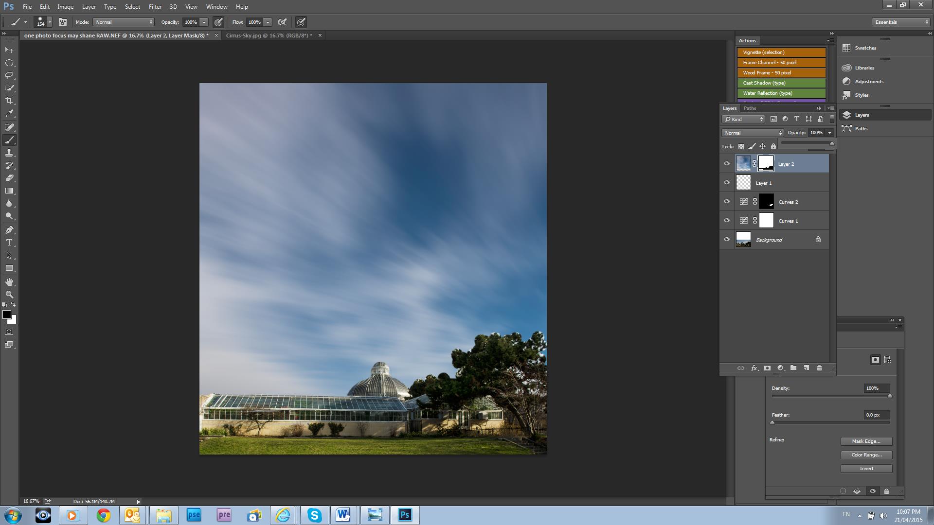
- Another PS class taught me a shortcut! Switched all layers off except for the background and from the menu selected the colour range option.
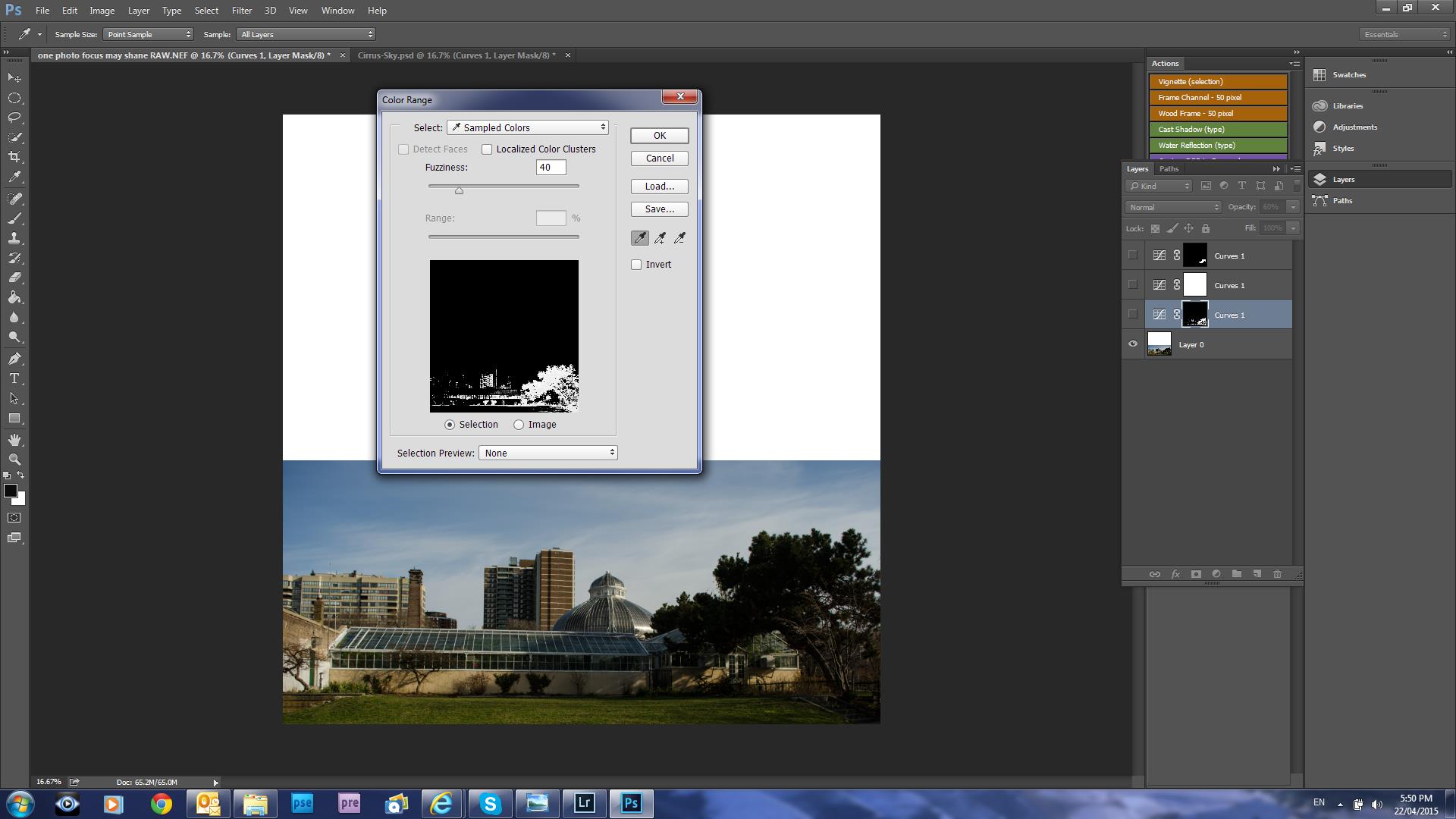
- Picked the lighter green shades of the pine tree then created a copy of the selection and moved that new layer on top of the sky layer.
- Fiddled around with the layers to refine the edges of the tree foliage, the glasshouse roof and dome. This took me ages, as the ugly building would sometimes reappear and I kept getting mixed up with the various layers and masks. Ensuring you have the correct layer activated was a major learning for me!
- Nearly there! Used the dodge tool on the sky to emphasise the streaks in the cirrus clouds.
- At this point, I thought the left hand edge of the image was too light and lead the eye out of the picture. Couldn’t have that! So applied a diagonal gradient from top and bottom left.
- Saved the result before I lost the lot.
- Resized the image ready for publishing – big sigh of relief!
The result : the passage of time!
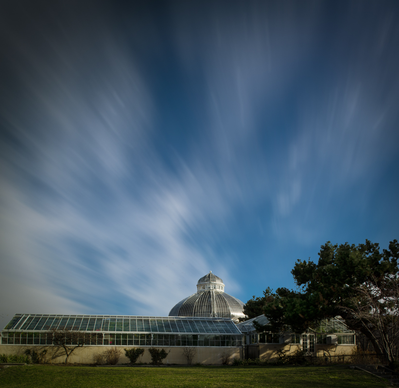
The passage of time over a graceful edifice.
Do take the opportunity to head over to Stacy Fischer’s site for this May One Photo Focus challenge and checkout other participants’ creative efforts. There are sure to be some very different interpretations.


Amazing transformation! Well done!
It was hard but fun for my first one!
Your first one! Very cool!
Thanks Amy!
Love your edit.
Thank you Laura!
You’re welcome!
Glad to have helped Chris. Looks good.
Many thanks Leanne!
what a super sky!
Thank you so much!
I love it Chris!
Thanks Cybele – it was a learning test!
Pingback: ABFriday Week 47: May One Photo Focus | Visual Venturing
Oh my gosh, Chris!!! A newbie at PS?? I don’t think so. You sound like an old pro. I LOVE the vision you had for Shane’s image! You transformed what I considered to be a very difficult image into something magical. I am so glad you decided to take the plunge and join in the fun (and I’m hoping you’ll be back for more!).
My apologies for my tardiness in commenting. I’ve had a few very busy days!
Thanks so much for the lovely feedback Stacy! Old, yes, Pro, no! 😀 Definitely game to do more! When is the unveiling for the next one?
LOL! As for the unveiling, May 22 (turns out there’s an extra Friday in May 😀)
Wonderful job and very interesting end result! I love compositing and learning how to realize a vision with these digital tools we have. You did a great job!
Thank you Judy for your nice comments.
My pleasure!