Here we are in Week 3 of the One Four November Challenge hosted by Robyn at Captivate Me.
Processing 3: Storm brewing!
For this week’s image processing, I have decided to change the mood, and go from fresh Pampas grasses swaying in the sunshine, to a “storm brewing” feel.
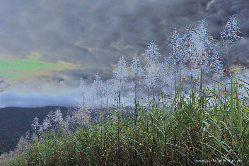
I used my Week 2 processed image as the base and then applied a Solarising Filter – nothing else is changed. I like the drama of the dark clouds and heavy weather look behind the glowing pampas heads.
Weeks 1 to 3 progression
What do you think?
It has been great fun to play with the software and also look at what other Challenge participants are doing. It is fascinating to see how images change in mood, impact and appeal depending on the processing techniques applied.


I like the glow!! it makes it dream like!!
Thanks Cybele, I was a bit nervous about this one, but thought it would be good to experiment.
Wow! As you say, what a change in mood. It is amazing how the image changes with the different processes. I like the way the pampas really comes forward in this edit. The heads on the right grab my attention straight away – then I move around the rest of the image.
It almost has a cartoon feel too – not sure if that is quite right?
This one makes me ponder… good job Chris 🙂
Oh, the cartoon feel is definitely not intended. I don’t see it myself, what creates that feel for you? Any suggestion you can give me is welcome!
Art is in the eye of the beholder 😊
I may be the only one who reads the image this way.
I think its the fine-ness that gives a ‘liney’ feel. Does that make sense. Absolutely no negatives here. Its a great edit Chris!!
PS I love that you’re experimenting Chris 🙂
Well I need to Robyn… I have a lot to learn! Plus, what’s the risk? You might get a couple of “I didn’t like that bit” but that in itself helps you work things through. This is a pretty good group of participants who help with their feedback and their own work.:)
I think we can always learn more. I know thats true for me 😊
It is all part of moving forward and I do agree – we have a wonderful helpful group happening here 😀 Very exciting!
PS Chris – We’re including polls next week for people to vote for their favourites of your image – IF you want to 🙂
Yes, you’ll be proud of me… I worked out how to incorporate the poll in my post!
Woohoo! I am proud 😊
I havent done one yet, so you may be getting some questions…lol
Good on you Chris!
You are a clever lady. Beautiful!
Thanks Kaz, nice to get your feedback 😊
Wow! I love this…can eeriness draw you in?
Don’t know whether it draws you in, but it might intrigue you and leave you wondering what will happen next!
Really interesting to see the progression and how the same image can become very different depending on the technique. I’ve never really been bold enough to change the mood of one of my photos—always just trying to make it clearer to the viewer—so congrats on the experiment! I like this last one with its feeling of suspense.
Thanks for commenting on this one, Ellen! Photo processing is new to me too; I have always kept it to a minimum, typically doing minor adjustments to shadows and highlights, cropping, straightening the horizon line (often needed when shooting from a boat)… I’m a strong believer in getting things right in camera rather than manipulating an image afterwards. So this project takes me out of my comfort zone, but as you say, it’s really interesting to see how little tweaks can result in significant changes. So I’m hoping that by taking part in this challenge, I will learn what’s worth doing to fine tune some of my images. That’s the plan anyway!
Sounds great! Looking forward to more!
This is superb … like watching the progressive storm brewing quality of the processes .. this last process really gives the electric feeling of a storm coming up in a big way .. beautiful work!
Thanks for the wonderful feedback. Even more brewing coming up next week! 🙂
The pampas almost look like they are covered in frost… 🙂 Really different feeling here!
Yes they glow and stand out more against the dark sky.
What a change! I like this dramatic look, especially those frosty pampas against the sky. My only small problem is that green patch of sky, I think it would look much more dramatic if you replaced it with the darker sky. But, that is just my eye…I really like the atmosphere.
Yes that green patch… I played around with that trying to change the colour but it was too obvious. What I now realise is that I probably should have used the clone tool to replicate the nearby clouds! You live and learn. 🙂
thought I already commented..but I guess not!
I love that your the grass looks so silvery…
You did about 5 hours ago! I can see it In the comments list in my dashboard – approved – but it has not come through on the actual post. Weird! Anyway, glad you like the glowing pampas.
What an interesting effect. I love the way you have made the images into the clever slide progression. I can’t imagine how you did that.
Thanks Suzanne. The slide progression is easy… I got the idea from another participant. You just click on add media/create a gallery, then display your images as a slide show.
That green in the sky is a bit disturbing but I like the effect it had on the pampas grass, they are very ethereal against the grey part of the sky.
Yes I fiddled for a while to try and change the colour after applying the solarising filter, but it made things worse so in the end I just loaded the post… only to realise I should have just used the cloning tool to replicate some of the clouds over that patch… Lesson learnt… there is only more than one way to fix things! 🙂
I love the threatening clouds in this version, Chris! They really wake up the image and allow the grass to pop. But I agree that the green sky skews it a bit for me, too. Perhaps desaturate the green a bit? I’d be tempted to duplicate the layer in Elements, desaturate it, apply a concealing mask (the black one) to that layer, and then paint the green part back in with a soft semi-opaque brush. Or yes, just clone it out. Just a suggestion…the rest of the image looks great!
Thanks for the very useful ‘how to’ suggestions, Katrina. I will have a go and load it up next week together with the fourth edition!
I liked the storm effect but not the green, a bit too siFi looking. Good effort though. Sue
Yes, have fixed that now and will post an updated version next week!
I love the change in mood but there is now a green cast in the sky -upper left where a patch of blue used to be. Is that my monitor?
OK, I hadn’t read the comment till now. I agree with cloning out that part of the sky. The time would be worth it as this is nicely dramatic and a keeper!
Hi Emilio, not your monitor… The effect of solarisation gone wrong. Will be fixed in the next attempt… See previous comments.
Having scanned the comments I am glad that the green cast will be fixed, because apart from that I really like the processing. It is different but not too over the top.
Thanks Ben – check it out tomorrow and see what you think☺️