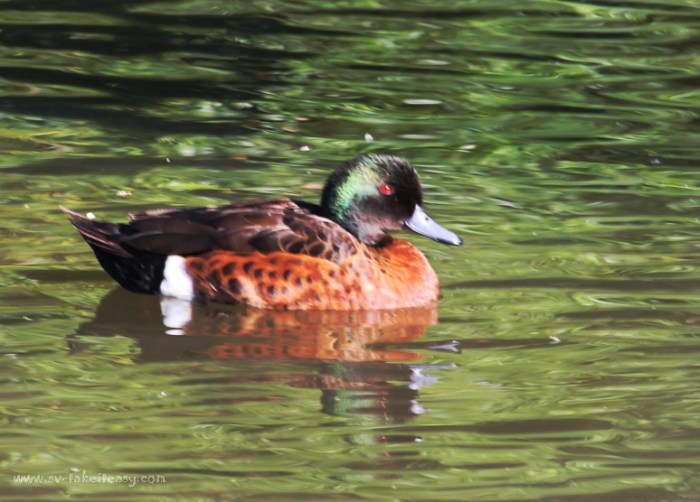
We are now in Week 2 of the One Four Challenge, a photo editing project hosted by Robyn Gosby at Captivate Me. I am glad I chose this little fellow to work on this month as I have picked up ideas already from the feedback kindly given by other participants.
Week 2 Interpretation
This week, I want my little Chestnut Teal to stand out more in his glorious colours so the whole image really pops. So here is what I have done:
- Cropped a tiny bit of the image to move the duck a fraction to the left, as suggested by SueJ, to give him a little more room to swim!
- Created a background layer and applied a colour burn at 50% opacity. This gave the whole image more vibrance and intensity of colour (thanks Stacey and Loré),
- Applied the filter Distort/Spherise at 100% to bring out the Chesnut Teal a little more. It is a subtle effect, but it works in my eyes.
Here is the result:
As a reminder, this is the progression to date:
I found some of your comments were very helpful, so again welcome your feedback.


Beautiful! Striking red eyes. 🙂
Yes they are . Thanks for commenting.
yes , I like the crop and the position of the duck in this one too! A marvelous ruby eye!! Good work!!
Thank you Cybele!
It look great! More prominent.
Thank you 😊
Yes I like this a lot, better tonal range across the water and the extra punch with the bird is just enuf to make him the focus of the image, nice job Chris
Thanks for the feedback Stacey and your suggestion last week.
Lovely! The little teal is much more prominent!
It’s amazing what playing with saturation and hues can achieve, and daring to be a little bolder with colours. Thanks for your feedback, Sue.
🙂
Subtle but it certainly works…
😊😊
The colours are better in this image, subtle but a good change.
Thanks Ben, yes I like the stronger colours.
Its subtle, but very effective….really makes the water look like it is in motion. Nice.
Thanks!
I like the contrast od the bird & the water. The enhanced colours in the Teal really set him up in the environment
Thanks Sue – the heightened colours make a big difference
Oops hit send too quickly! I was going to say I am learning to get bolder with them!☺️
Chris, the water on this is just an amazing color… your edits made a quite a bit of difference from last week. Great job. It’s amazing what a little tweak can do. 😀
Yes – I picked up the idea of using the colour burn with reduced opacity from another participant a few weeks ago, and I like what can be achieved. Getting a bit more daring with colour intensity, too! Thanks Nic!
Chris, Ive enjoyed reading everyone’s comments this week and I like all the things you’ve put into place here. The colours of the duck and the water are great. He is definitely the focus in all his finery. Nice job 😃😃
Thanks Robyn. It’s a simple subject but it allows me to work on a few editing processes I was not familiar with!
Simple is good Chris. Learning is good too 😃😃
Good morning!
Great water colors and rich feather colors too. He is looking mighty fine 🙂
😊 he glows in the sunshine doesn’t he!?
This looks lovely, slight changes work really well. It is so easy to go one stw too far, but you found a good balance.
Thank you!