We are now in Week 3 of the One Four Challenge, a photo editing project hosted by Robyn Gosby at Captivate Me. I am of course continuing to play with my little Chestnut Teal.
Week 3 Interpretation
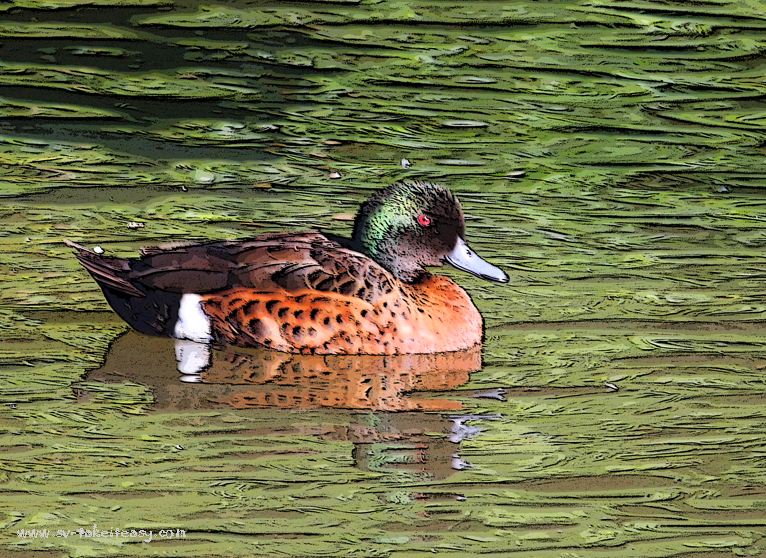
This week, I have given the duck an artistic treatment by doing the following in Photoshop Elements 9:
- Started from the Week 2 image
- Selected the artistic filter – poster edges
- Tweaked the settings until I was happy with the effect-
- Edge thickness: 1 out of 10
- Edge intensity: 3 out of 10
- Posterisation: 2 out of 6
- Increased saturation to bring out a little more vibrancy, as the effect had somewhat dulled the colours.
I am particularly happy with the marbling effect on the water and the richness of colours in the duck and look forward to hearing what you think. Here is the result, which is best viewed in full screen:
Week 3 – Poster Edges
Just as a reminder, here is the progression to date:
Many participants are taking part in this exciting project. To check out their images, click on this One Four Challenge link.


This is a really interesting edit – it looks almost like textured enamel on tile. I particularly like the effect it has on the appearance of the water. 🙂
Hi Louise – I had not thought of that! Thank you for your comment.
Great job! I love the marbling on the water, it has great texture. The duck has a nice brightness to it too.
Thank you Katie 🙂
Hi Chris – this is a wonderful edit.
My favourite of your Chestnut Teal so far.
The water is great – it does give an embossed enamel feel and I like the detail in the duck this week. Very nice!
Also looking forward to reading your Introduction with Leanne 😃😃
Thank you for the lovely feedback… and Leanne… well that was a nice surprise when she contacted me on the weekend! Very chuffed about that:))
Me again Chris 😃 A great interview and a very enjoyable read. Great images too.
Imagine my surprise to see a mention… Thankyou xx I really appreciate it and I’m so happy that you ARE captivated and challenged. Love it!!
Thanks Robyn – well deserved – I mean the mention of your challenge & website. 🙂 I still can’t believe Leanne picked me… My work just doesn’t compare with the normal standard of portfolio that gets displayed on those intros… But I am not complaining LOL!
It is an interesting effect. It almost looks like oil painting brush strokes!
True. I found it reminded me of marbling on silk, when you drop the colours then create the pattern with a stick… Does this make sense??
This little duck really shines through. I love how smooth it all looks, a very nice job. And congrats on your Introduction, such a nice thing. Your cat is gorgeous.
Thank you Lore for the feedback here and your lovely comments on Leanne’s site AND the follow. You are very kind and I appreciate your interest😊 Chris
You are welcome.
The duck is always charming, but the hard edges are a bit too harsh for such a sweet creature. The technique is really awesome, however and I love what it did with the water in particular.
I had to go back to my previous images to see the difference… I can see what you mean around the belly especially, but I still like the overall effect. Thanks for commenting! 🙂
very subtle effect. I’m a bit afraid of the poster effect but this is well done Chris!!
Thank you Carrie – just an experiment.
Cybele 😀 – but you are very welcome!!
Excellent! I love this week’s. The water is great. Something strikes me as odd about the reflection of the duck in the water. It should be water, but the texture or pattern of the water ripples disappears. I wonder what you’d do with that, Your photoshop technique is great. This week’s is my favorite so far.
Thanks Joanne – it’s true the reflections are less prominent. You are very observant! I am not sure how yo bring them back either – might have to be with selective colour change… A bit beyond me!
I have found the previous versions quite soft, this weeks process has defined the shapes and lines defining the image a lot more.
Is that good or bad?
Thats good, I can now see the details where as before they were hard too see.
The water colors really are so lovely here, marble greens are beautiful. Each week is a true improvement on this image, way to go!
What a nice compliment Carrie; let’s hope it keeps going till the end!
This is beautiful with the patterns in the water and on the duck.
Thank you!
Great week three photo! I like how you did the slideshow to show your progression. I think I might steal that idea for next week :-). Your color burn on week two really made the picture pop.
Thanks Kristen – one photo per week, really! I just remind people of the progression – saves having to go back to previous posts😊
It is a great idea!!
I like the added dark lines it gives the image more detail. I too love what it did to the water. Great edit 😀
Thanks Nic😊
I like the 3d embossed and engraved effect you achieved this week, esp with the water 🙂
It’s funny what other people see… I wouldn’t have thought of a 3D or embossed effect! But you see it and like it, so I’m happy! 🙂